
Motivation
A traditional correlation matrix carries a large amount of redundant information. For variables it has cells, but only of them are unique: the diagonal is all self-correlations (), the two triangles mirror each other, and large blocks of within-category correlations are often irrelevant, and contribute to reduced statistical power. As grows, the interesting between-category relationships are buried in this redundancy and the figure becomes unreadable.
The correlation wheel was introduced by Gharibans et
al in the first clinical paper to show that spatial dysrhythmias as
measured on the body surface, correlated with gastroduodenal symptoms.
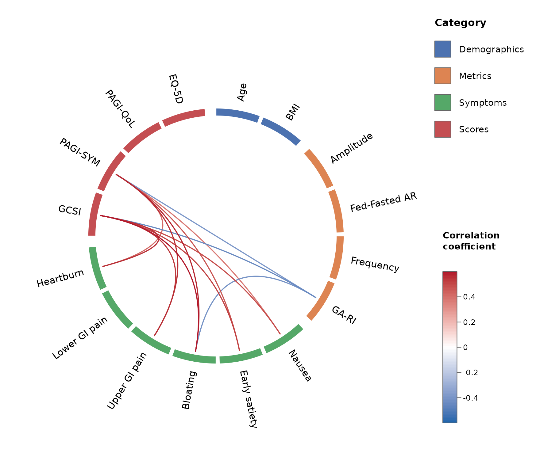
The correlation wheel shows variables at the periphery of a circle,
grouped by category, and only the correlations of interest are drawn as
curved links coloured by the strength of their coefficient, and filtered
based on custom statistical significance thresholds.
circlecorR reproduces these features to generate a
correlation wheel plot using standard patient-per-row type dataframes in
R, with optionality to customise the grouping, colours, and
statistics.
Since then, several notable papers in the field of gastric electrophysiology have leveraged these plots, including:
- Gharibans AA, Coleman TP, Mousa H, Kunkel DC. Spatial patterns from high-resolution electrogastrography correlate with severity of symptoms in patients with functional dyspepsia and gastroparesis. Clin Gastroenterol Hepatol. 2019 Dec;17(13):2668–77. DOI: 10.1016/j.cgh.2019.04.039
- Gharibans AA, Calder S, Varghese C, Waite S, Schamberg G, Daker C, et al. Gastric dysfunction in patients with chronic nausea and vomiting syndromes defined by a noninvasive gastric mapping device. Sci Transl Med. 2022 Sept 21;14(663):eabq3544. DOI: 10.1126/scitranslmed.abq3544
- Wang TH-H, Varghese C, Calder S, Gharibans A, Schamberg G, Bartlett A, et al. Long-term evaluation of gastric electrophysiology, symptoms and quality of life after pancreaticoduodenectomy. HPB (Oxford). 2025 Dec;27(12):1535–42. DOI: 10.1016/j.hpb.2025.09.003
- Xu W, Wang T, Foong D, Schamberg G, Evennett N, Beban G, et al. Characterization of gastric dysfunction after fundoplication using body surface gastric mapping. J Gastrointest Surg. 2024 Mar;28(3):236–45. DOI: 10.1016/j.gassur.2023.12.023
- Xu W, Gharibans AA, Calder S, Schamberg G, Walters A, Jang J, et al. Defining and phenotyping gastric abnormalities in long-term type 1 diabetes using a novel body surface gastric mapping device. Gastro Hep Adv. 2023 Aug 18;2(8):1120–32. DOI: 10.1016/j.gastha.2023.08.005
Installation
Install the released version from CRAN:
install.packages("circlecorR")Or the development version from GitHub:
# install.packages("remotes")
remotes::install_github("kriz98/circlecorR", build_vignettes = TRUE)
Dependencies (circlize and psych) install
automatically with either command above.
Quick start: straight from your data
circlecorR is designed to work straight from a data
frame – one row per subject and one column per
variable – with no separate step to build correlation matrices
yourself. Hand that data frame directly to corr_wheel() and
it computes the correlations (and p-values) for you.
The only other thing you supply is groups: a named list
mapping each category to its variables. This both
selects which variables appear (any other columns, such
as an ID, are ignored) and sets their order around the
wheel.
In homage to Gharibans et al seminal paper, we use a synthetic
gastro_symptoms dataset throughout this vignette (see
?gastro_symptoms for its exact shape). This synthetic
example dataset is bundled with the package. Swap it for your own data
frame (one row per subject) to use your own data.
groups <- list(
  Demographics = c("Age", "BMI"),
  Metrics      = c("Amplitude", "Fed-Fasted AR", "Frequency", "GA-RI"),
  Symptoms     = c("Nausea", "Early satiety", "Bloating",
                   "Upper GI pain", "Lower GI pain", "Heartburn"),
  Scores       = c("GCSI", "PAGI-SYM", "PAGI-QoL", "EQ-5D")
)
# `gastro_symptoms` is a synthetic per-row example dataset shipped with the package
head(gastro_symptoms[, 1:5])
#>   Age  BMI Amplitude Fed-Fasted AR Frequency
#> 1  74 41.0  30.26932     2.0004345  2.808546
#> 2  51 42.8  29.15670     0.7884043  1.760702
#> 3  59 36.2  29.73068     0.1899037  3.483917
#> 4  47 40.8  31.16330    -0.8294263  2.842009
#> 5  29 46.1  31.07111     0.9579552  4.015299
#> 6  50 36.4  29.86780    -2.0601868  1.179358

corr_wheel(
  gastro_symptoms,             # raw data: one row per subject
  groups      = groups,
  method      = "pearson",     # correlation method
  adjust      = "hochberg",    # multiple-comparison adjustment (see below)
  sig_level   = 0.05,          # hide links with adjusted p > 0.05
  r_threshold = 0.3,           # ...and links with |r| < 0.3
  r_limits    = c(-0.6, 0.6)
)
Hiding self- and within-category correlations
Two of the wheel’s most important features are that it never
draws self-correlations (the diagonal) and, by default,
hides within-category correlations
(hide_within_group = TRUE). This removes the redundant
parts of the matrix and leaves the between-category structure.
Crucially, this is carried through to the
statistics. Multiple-comparison correction penalises
you for the number of hypotheses tested. If self- and within-category
correlations are never tested, they should not count towards that
family. corr_wheel() therefore applies the adjustment over
only the correlations it displays. Shrinking the family
makes the correction less severe, thus improving power, while remaining
statistically consistent with what is shown.
res <- corr_wheel(gastro_symptoms, groups = groups, adjust = "hochberg",
                  r_threshold = 0.3, r_limits = c(-0.6, 0.6))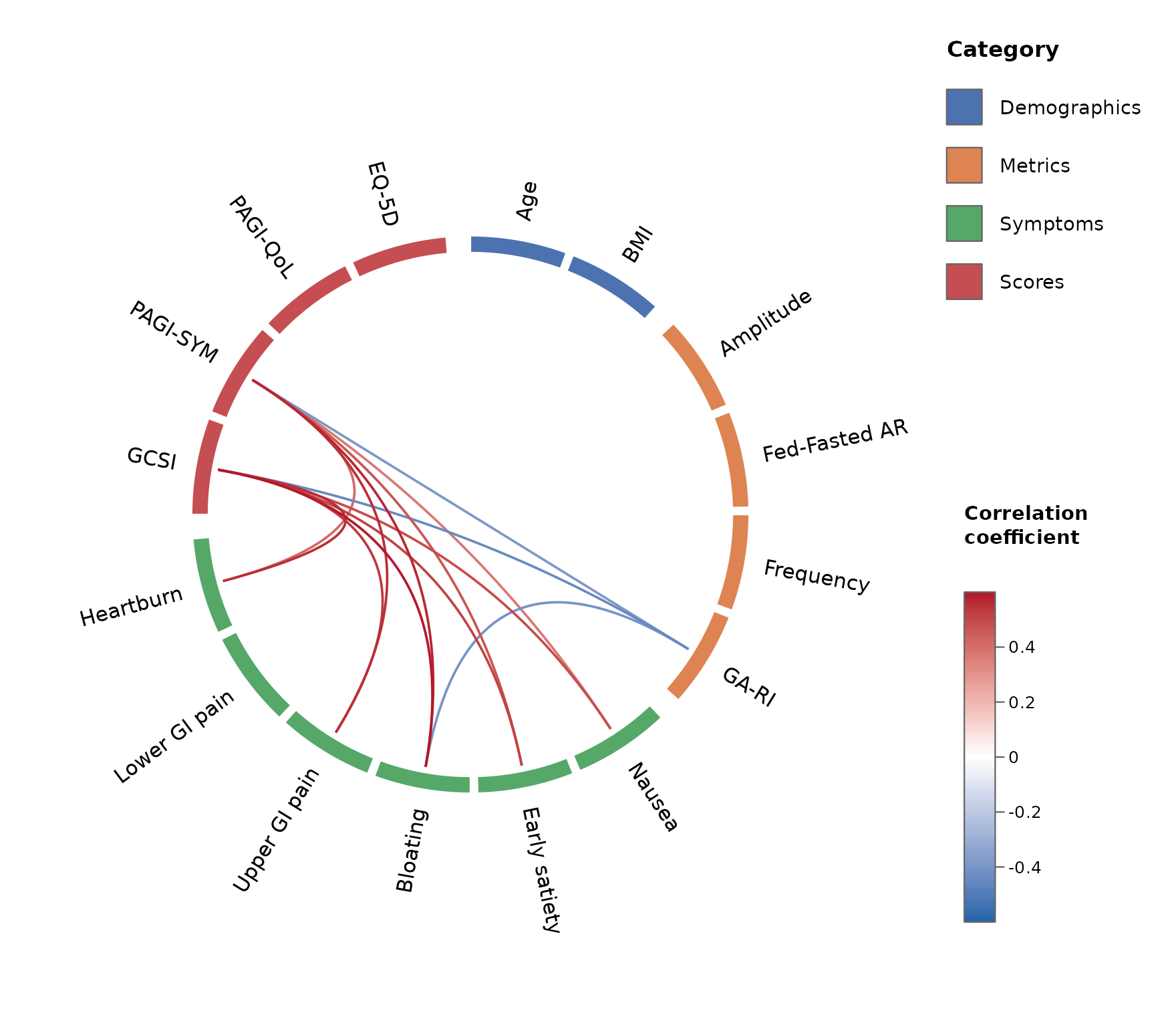
k <- length(unlist(groups))
cat("Unique correlations in the full matrix:", k * (k - 1) / 2, "\n")
#> Unique correlations in the full matrix: 120
cat("Correlations actually tested (the family):", res$n_tests, "\n")
#> Correlations actually tested (the family): 92
Because the family is smaller, each raw p-value is corrected by a smaller factor. Taking Bonferroni for a transparent example, the same correlation is penalised by the number of tests in its family – here 92 rather than 120:
p_raw <- 5e-4                       # a raw p-value for one correlation
k_all <- k * (k - 1) / 2

cat("Bonferroni across the full matrix:", signif(p_raw * k_all, 3), "\n")
#> Bonferroni across the full matrix: 0.06
cat("Bonferroni across the family only:", signif(p_raw * res$n_tests, 3), "\n")
#> Bonferroni across the family only: 0.046
The step-up methods ("holm", "hochberg",
"BH") behave the same way.
If you want the correlation and p-value matrices themselves, for a
table, a report, or any other purpose –
compute_correlations() is the same function
corr_wheel() calls internally, available on its own:
cc <- compute_correlations(gastro_symptoms, method = "pearson")
str(cc)
#> List of 4
#>  $ r     : num [1:16, 1:16] 1 0.000715 -0.094705 -0.208429 -0.007022 ...
#>   ..- attr(*, "dimnames")=List of 2
#>   .. ..$ : chr [1:16] "Age" "BMI" "Amplitude" "Fed-Fasted AR" ...
#>   .. ..$ : chr [1:16] "Age" "BMI" "Amplitude" "Fed-Fasted AR" ...
#>  $ p     : num [1:16, 1:16] 0 0.9944 0.3486 0.0374 0.9447 ...
#>   ..- attr(*, "dimnames")=List of 2
#>   .. ..$ : chr [1:16] "Age" "BMI" "Amplitude" "Fed-Fasted AR" ...
#>   .. ..$ : chr [1:16] "Age" "BMI" "Amplitude" "Fed-Fasted AR" ...
#>  $ n     : num 100
#>  $ method: chr "pearson"
#>  - attr(*, "class")= chr "circlecor"
Customising the look
Colour schemes
scheme sets the category colours and the diverging link
palette together, as one named preset. Built-in options are listed by
corr_wheel_schemes():
corr_wheel_schemes()
#> [1] "default" "colorblind" "ocean" "vivid" "alimetry"-
"default"– the seaborn-like categorical palette and a blue-white-red diverging scale used throughout this vignette. -
"colorblind"– the Okabe-Ito categorical palette with a colourblind-safe (PuOr) diverging scale. -
"ocean"– hue-varied cool tones (teal, blue, indigo, violet, slate) for categories, with a blue-to-warm diverging scale. -
"vivid"– a brighter, higher-contrast categorical palette, still paired with the blue-white-red diverging scale. -
"alimetry"– black and shades of blue through cyan for most categories, with a single gold used as a sparing highlight, and a matching blue-to-yellow diverging scale.
corr_wheel(gastro_symptoms, groups = groups, r_threshold = 0.3,
          r_limits = c(-0.6, 0.6), scheme = "colorblind")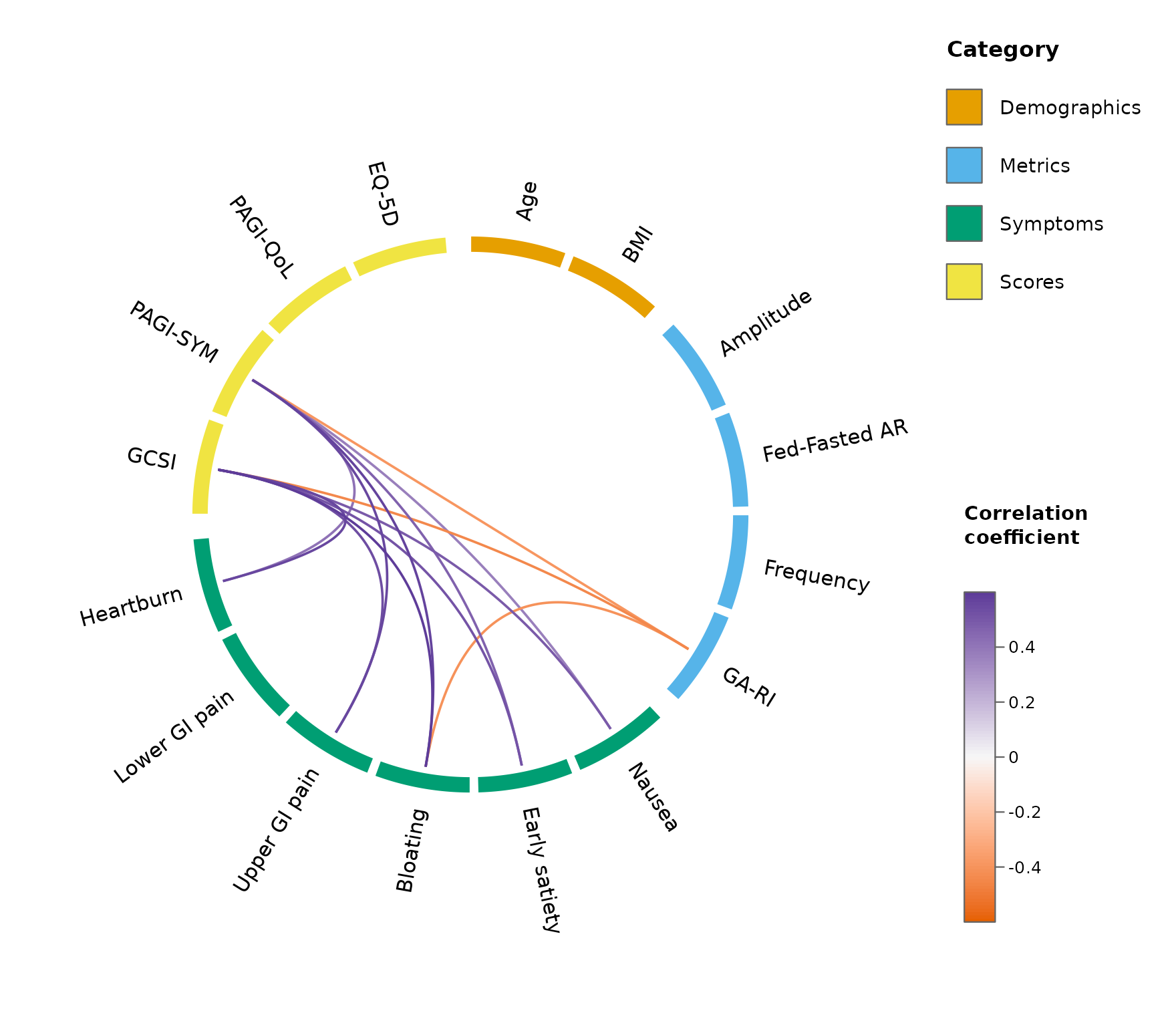
corr_wheel(gastro_symptoms, groups = groups, r_threshold = 0.3,
          r_limits = c(-0.6, 0.6), scheme = "alimetry")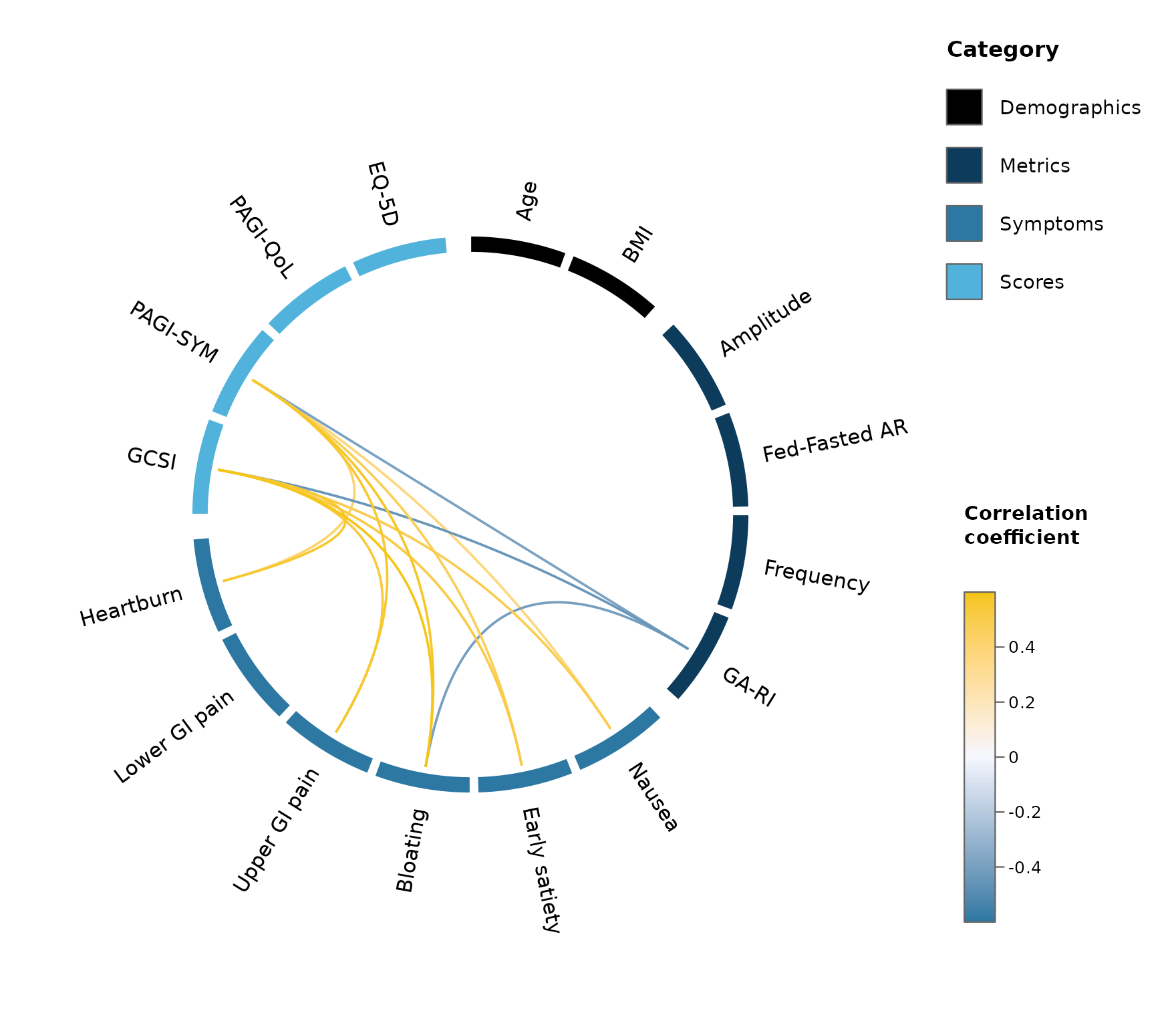
corr_wheel_scheme() returns a scheme’s definition so you
can start from a preset and tweak it – here, lightening the midpoint of
the diverging scale:
s <- corr_wheel_scheme("ocean")
s$palette[2] <- "grey96"
corr_wheel(gastro_symptoms, groups = groups, r_threshold = 0.3,
          r_limits = c(-0.6, 0.6), scheme = s)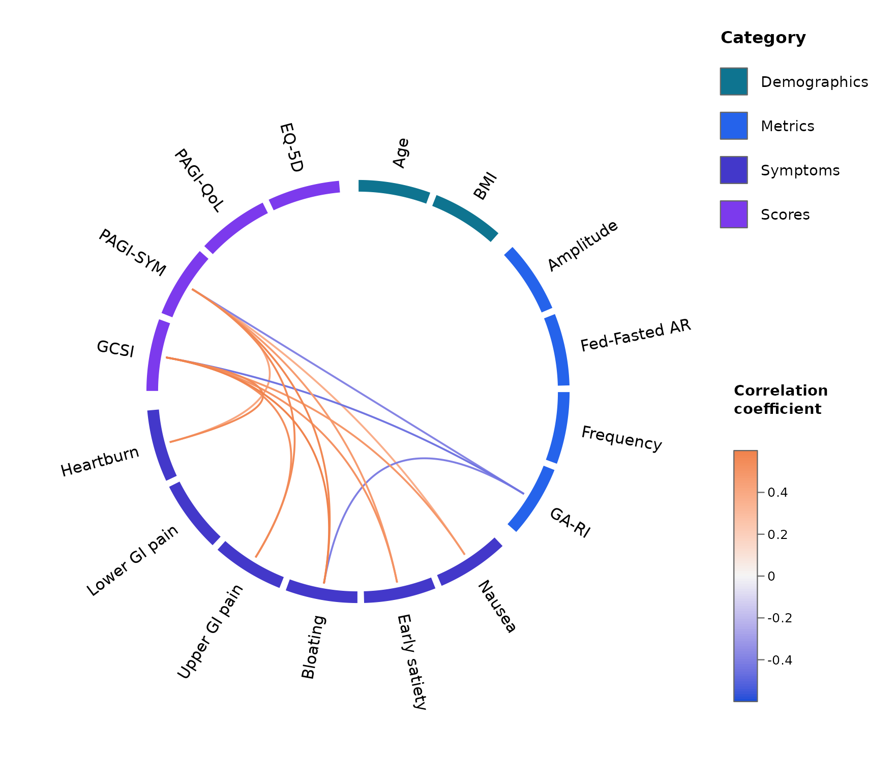
Or build one entirely from scratch by passing
list(colors = , palette = ) directly – colors
is an unnamed vector cycled across however many categories you have, and
palette is the length-3 diverging scale (negative,
midpoint, positive):
corr_wheel(gastro_symptoms, groups = groups, r_threshold = 0.3,
          r_limits = c(-0.6, 0.6),
          scheme = list(colors = c("#7B2CBF", "#2A9D8F", "#E76F51", "#264653"),
                       palette = c("#2A9D8F", "white", "#E76F51")))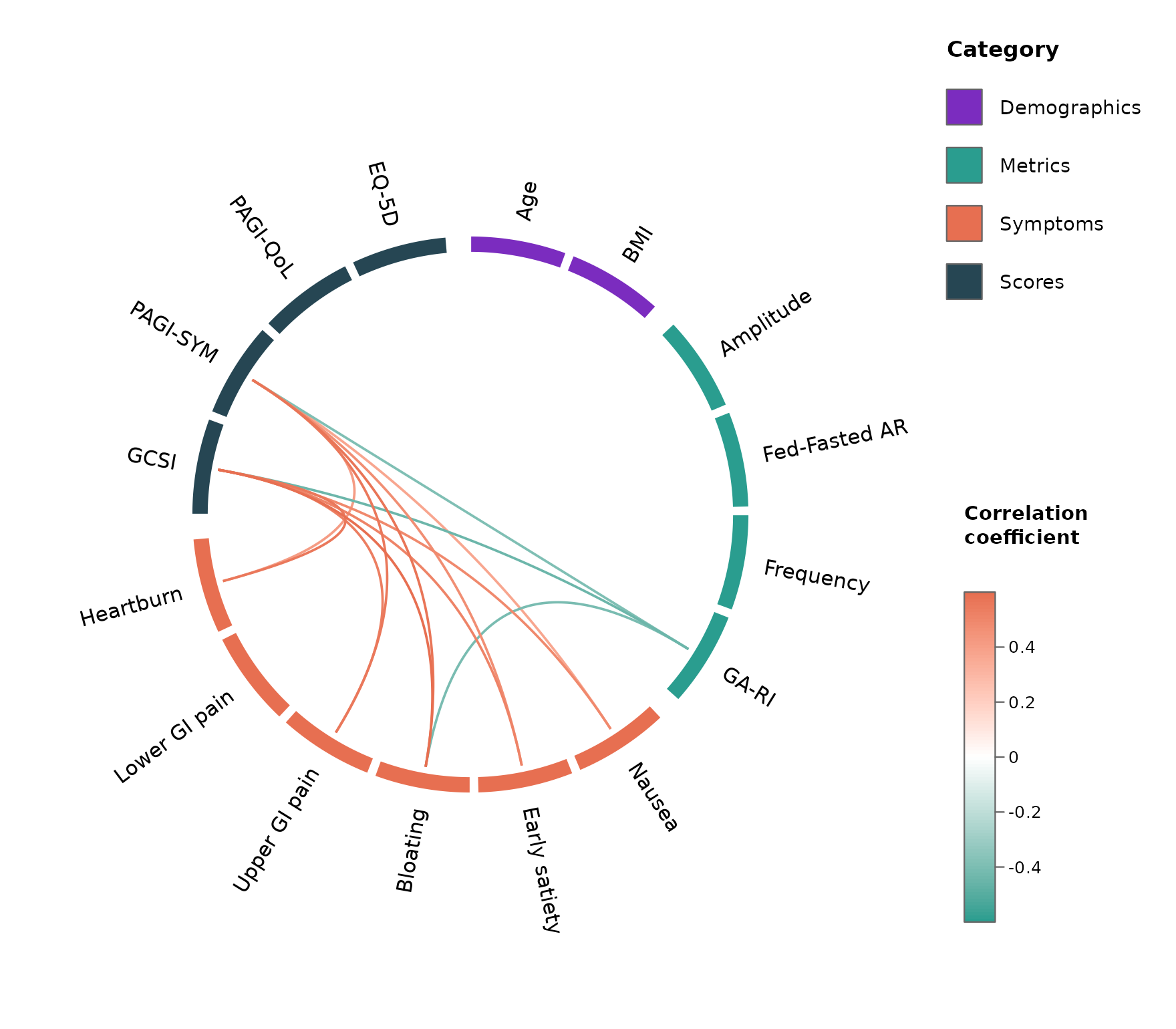
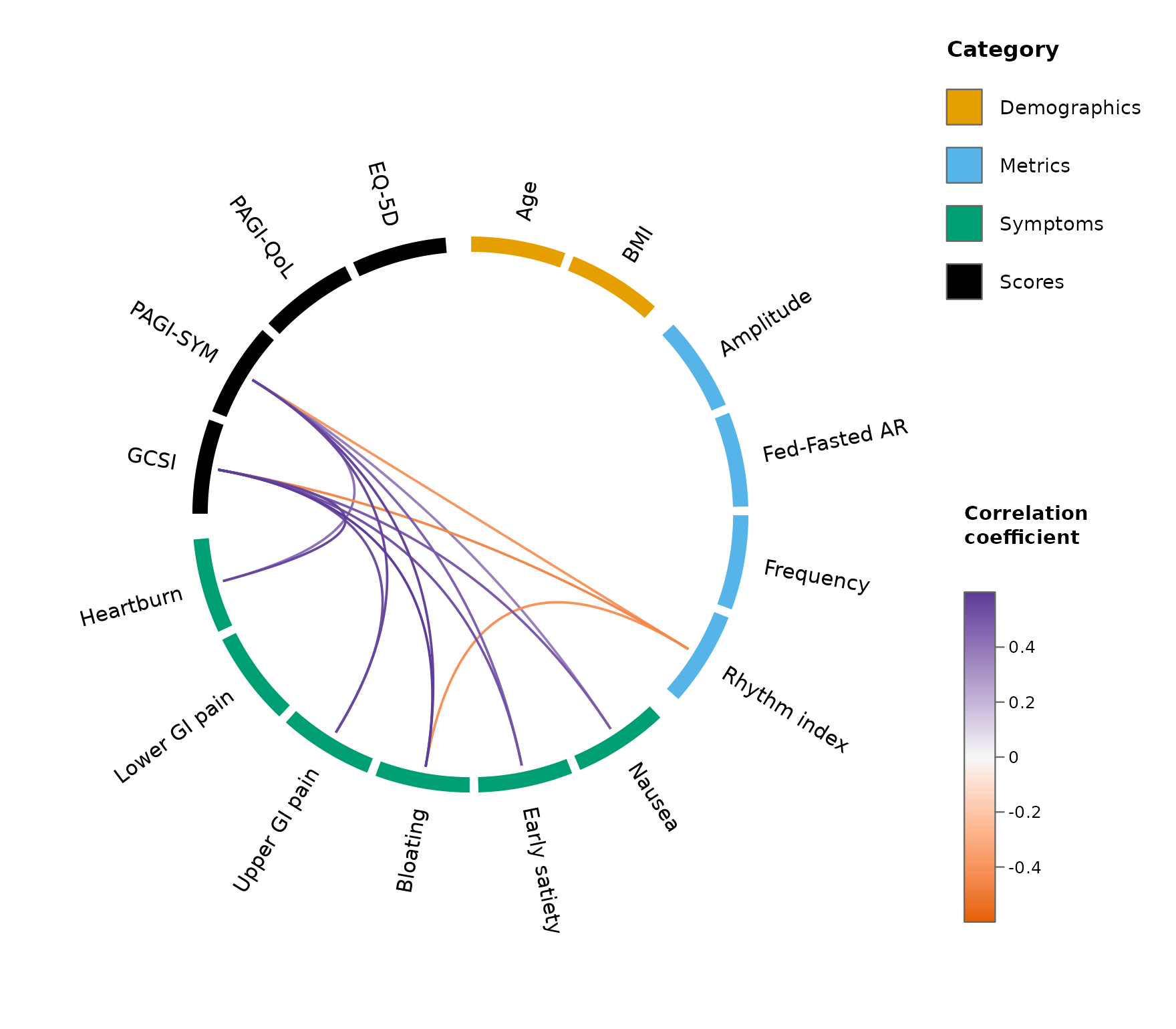
Colours and labels
colors maps categories to colours, layered on top of
scheme (or the default palette if scheme is
NULL) – only the categories you name are overridden.
labels gives pretty display names. Both are named vectors –
specify only the ones you want to change.
corr_wheel(
  gastro_symptoms, groups = groups, r_threshold = 0.3, r_limits = c(-0.6, 0.6),
  scheme = "colorblind",
  colors = c(Scores = "black"),          # override just one category
  labels = c("GA-RI" = "Rhythm index")
)
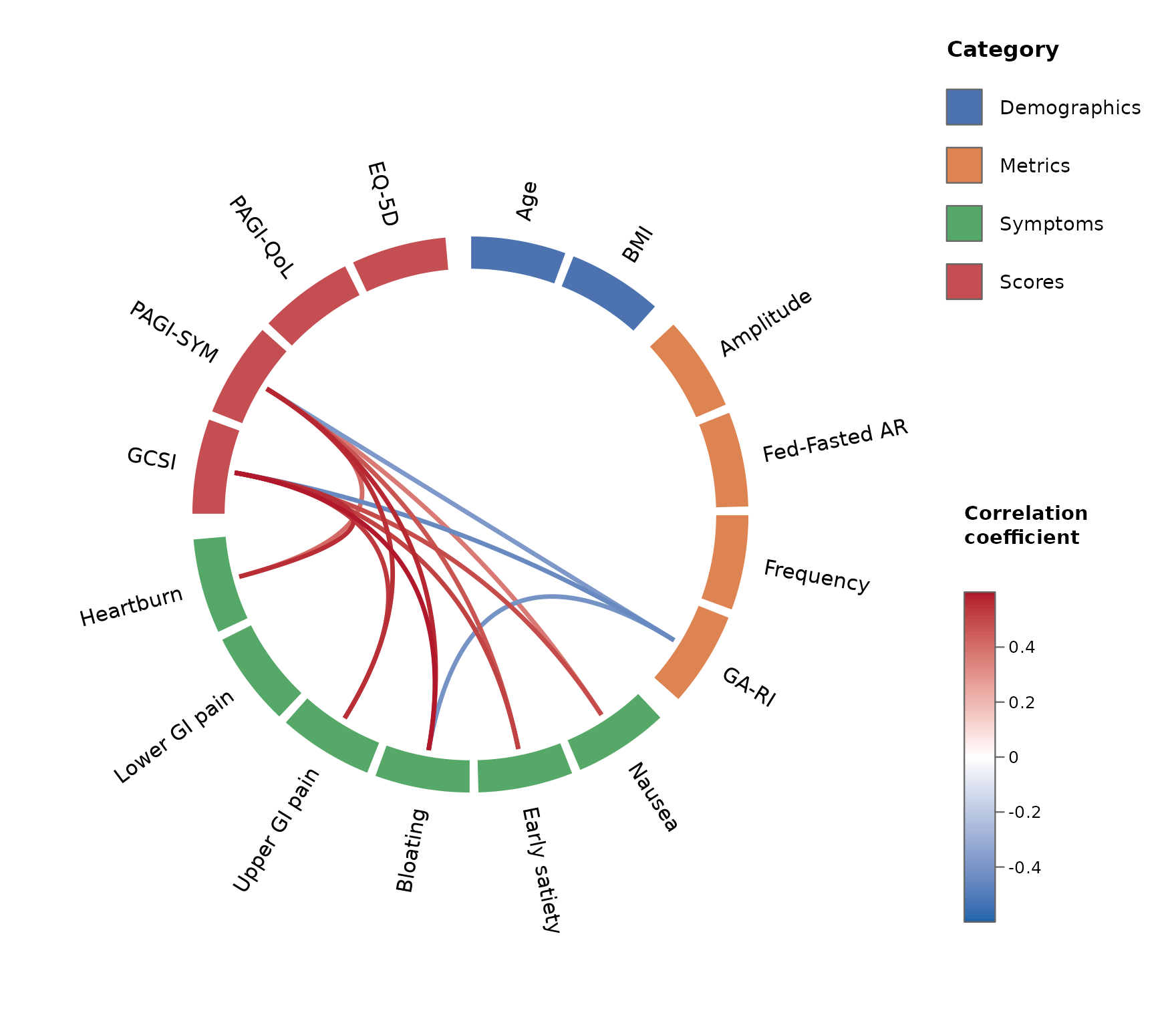
Size of blocks and lines
-
tile_height– radial thickness of the category blocks (smaller = thinner). -
link_lwd– line width of the links (larger = thicker).
corr_wheel(
  gastro_symptoms, groups = groups, r_threshold = 0.3, r_limits = c(-0.6, 0.6),
  tile_height = 0.12,   # thicker blocks
  link_lwd    = 3       # thicker lines
)
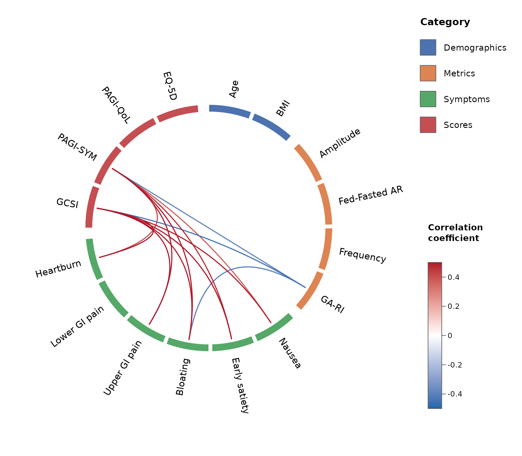
The diverging colour scale
palette sets the three colours at
c(-limit, 0, +limit) (overriding scheme’s) and
r_limits the scale range.
corr_wheel(
  gastro_symptoms, groups = groups, r_threshold = 0.3,
  palette  = c("#2166AC", "white", "#B2182B"),   # blue - white - red
  r_limits = c(-0.5, 0.5)
)
Saving to a file
corr_wheel() draws on the active graphics device, so
save it the usual way:
png("correlation_wheel.png", width = 2500, height = 2000, res = 300)
corr_wheel(gastro_symptoms, groups = groups, r_threshold = 0.3,
           r_limits = c(-0.6, 0.6))
dev.off()
Argument reference
Everything covered above, at a glance:
| What | Argument | Example |
|---|---|---|
| Category assignment & order | groups |
named list or variable = category vector |
| Colour scheme (category colours + link palette, together) | scheme |
"colorblind", "ocean",
"vivid", "alimetry", or
list(colors=, palette=)
|
| Category colours | colors |
c(Symptoms = "#55A868", Scores = "#C44E52") (overrides
scheme per category) |
| Pretty variable labels | labels |
c("GA-RI" = "Rhythm index") |
| Significance cutoff | sig_level |
0.05 |
| Multiple-comparison adjustment | adjust |
"holm", "hochberg", "BH",
"none"
|
| Minimum |r| shown | r_threshold |
0.3 |
| Hide within-category links | hide_within_group |
TRUE / FALSE
|
| Colour-scale range | r_limits |
c(-0.5, 0.5) |
| Link colour ramp | palette |
c("#2166AC", "white", "#B2182B") (overrides
scheme’s) |
| Block size (thickness) | tile_height |
0.06 (thin) … 0.12 (thick) |
| Line size (width) | link_lwd |
1.6, 3
|
| Rotation / spacing |
start_degree, group_gap,
node_gap
|
|
| Legend / colour bar |
legend, colorbar
|
corr_wheel() returns (invisibly) the ordered variables,
resolved group and colour maps, the colour function, and the masked
matrix actually plotted – handy for reproducibility or building a
caption.